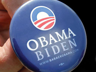
Most vexing of all from a design perspective is the particular flavor of nostalgia best described as a fantasy trip to the imagined past. If years gone by are continually portrayed as better times, how can we hope for actual better times to come? For one dispiriting example, compare the Obama campaign’s graphic design for 2012 to his 2008 efforts. The first iteration introduced the distinctive Gotham O logo, promising a new path to the future. This year’s “Betting on America” combines the O with folksy-feeling retro typography that seems to look backward, evoking the design of fruit-crate labels from the early 20th century. It is a pastoral, farmland version of a simpler America—one that couldn’t comfortably exist in today’s economy.

No comments:
Post a Comment